
Lunar New Year Red Envelope Design
2024 is the Year of the Dragon. The tradition is that during Lunar New Year, elders would give children red envelopes filled with some allowance cash for the New Year. These envelopes usually come with red and gold colors to represent auspiciousness. In my design, I kept the auspicious red and gold, but added symbols like dragon, ancient coins, and cloud to show the dragon concept. I applied a glossy gradient effect to the dragon, frame, and the two symbols (“Wishing You Earn Lots of Wealth” & ancient dragon symbol) on the front design as those are the key elements I want to highlight. Everything else I kept as a solid matte color. Have a wonderful Year of the Dragon everyone!

Red Envelope Design Layout

Red Envelope Front Design

Red Envelope Back Design
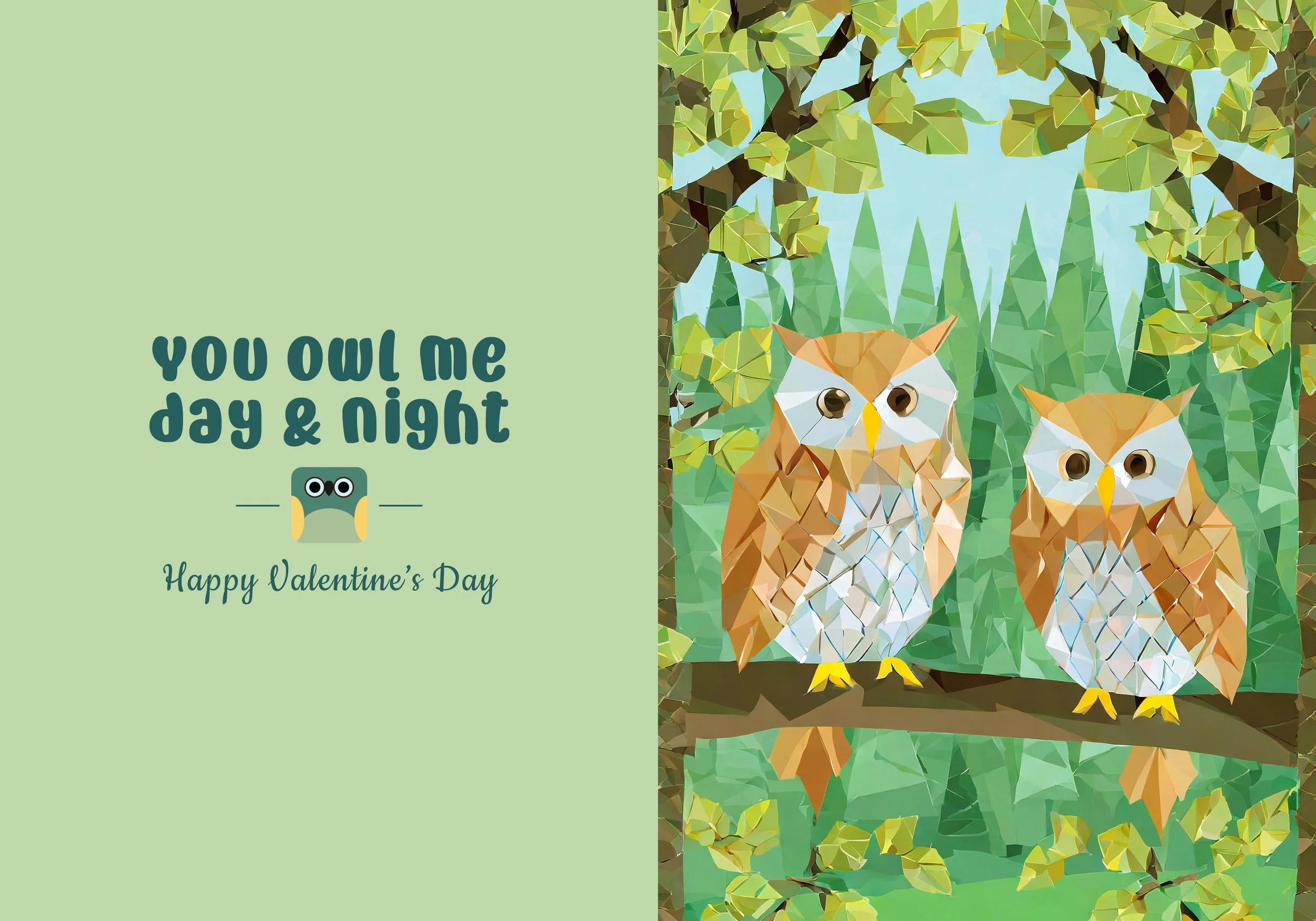
Valentine’s Day Card Design
I call this “all the Valentine’s Day cards at Target made me do it!” I’ve been playing with generative AI programs like Adobe Firefly and Midjourney a lot lately. And I wanted to incorporate elements of AI into my card design. I used search words and filters like “two owls sitting on a branch”, “origami”, and “vector art” on Adobe Firefly to generate my front cover illustration design. Most Valentine’s Day cards I like from Target come with cute play on words taglines. I came up with “You owl me day & night” tagline idea, with “owl” in place of “awe/ wow”. I also wanted to stay away from the traditional Valentine’s Day color palette for this card. So instead of red and pink, I went for a pastel green and blue palette.
Valentine's Day Card Design Layout
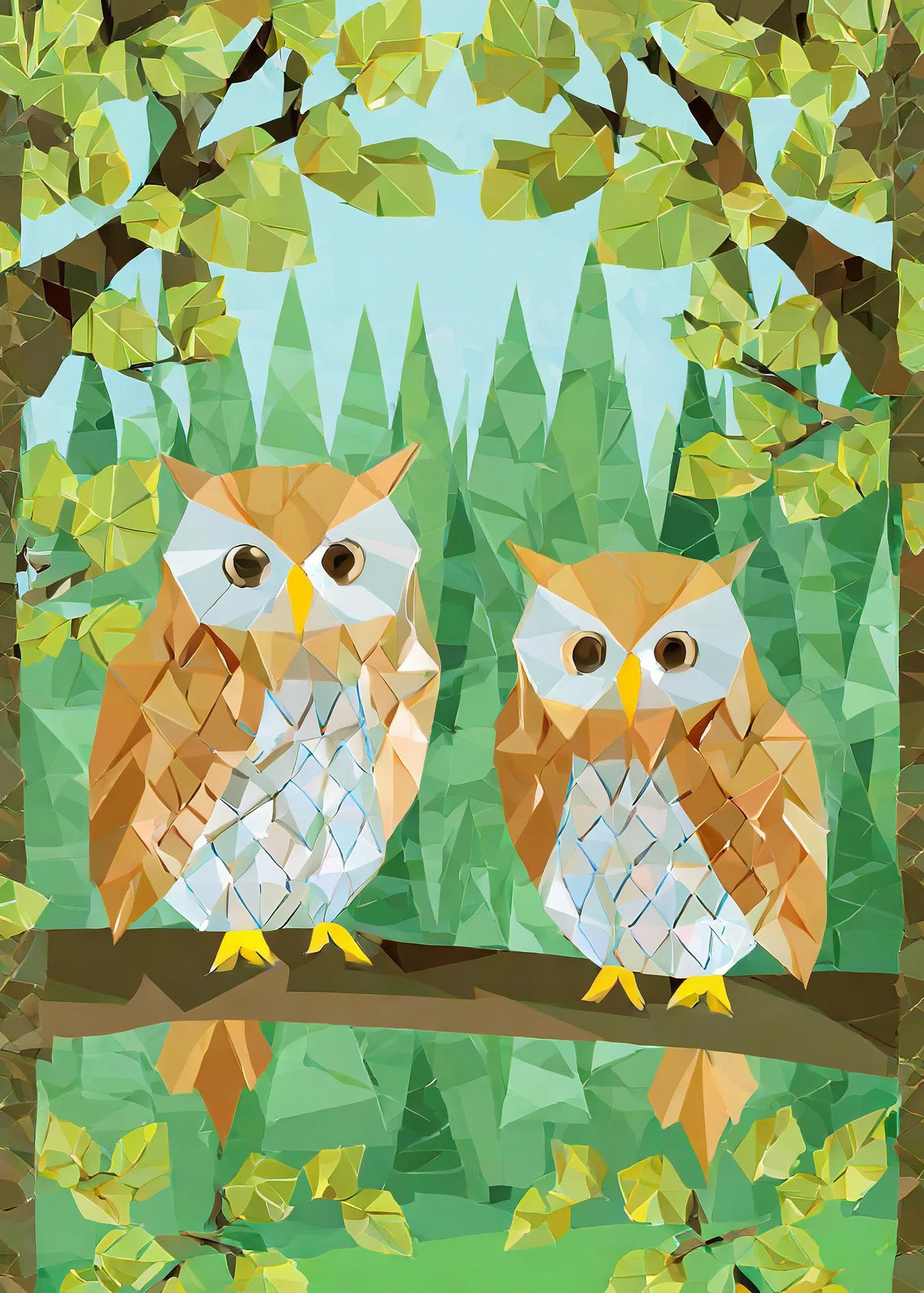
Valentine's Day Card Cover Design

Valentine's Day Card Back Design
Unofficial Nike Zegama Promotional Graphic Design
For this personal project, I wanted to design a promotional graphic of Nike’s Zegama trail running shoes. I wanted to highlight the outdoorsy nature of this shoes, just like how the product page promotes it. I picked a tagline font that has a rocky and gritty style. While reading the product description on Nike’s website, the 3 words that stood out to me the most were “grip”, “stability”, and “confident”. Therefore, I picked these 3 words as the supporting texts of my graphic. I went for a more handwritten font for these. Another phrase that stood out to me was “up and downs”. With this idea in mind, I broke down “ZEGAMA”, creating some up and down stroke typography pattern. Most assets I used for this graphic came from Nike Zegama’s product page, such as the product photo and scenario photo.

Nike Zegama Promotional Graphic
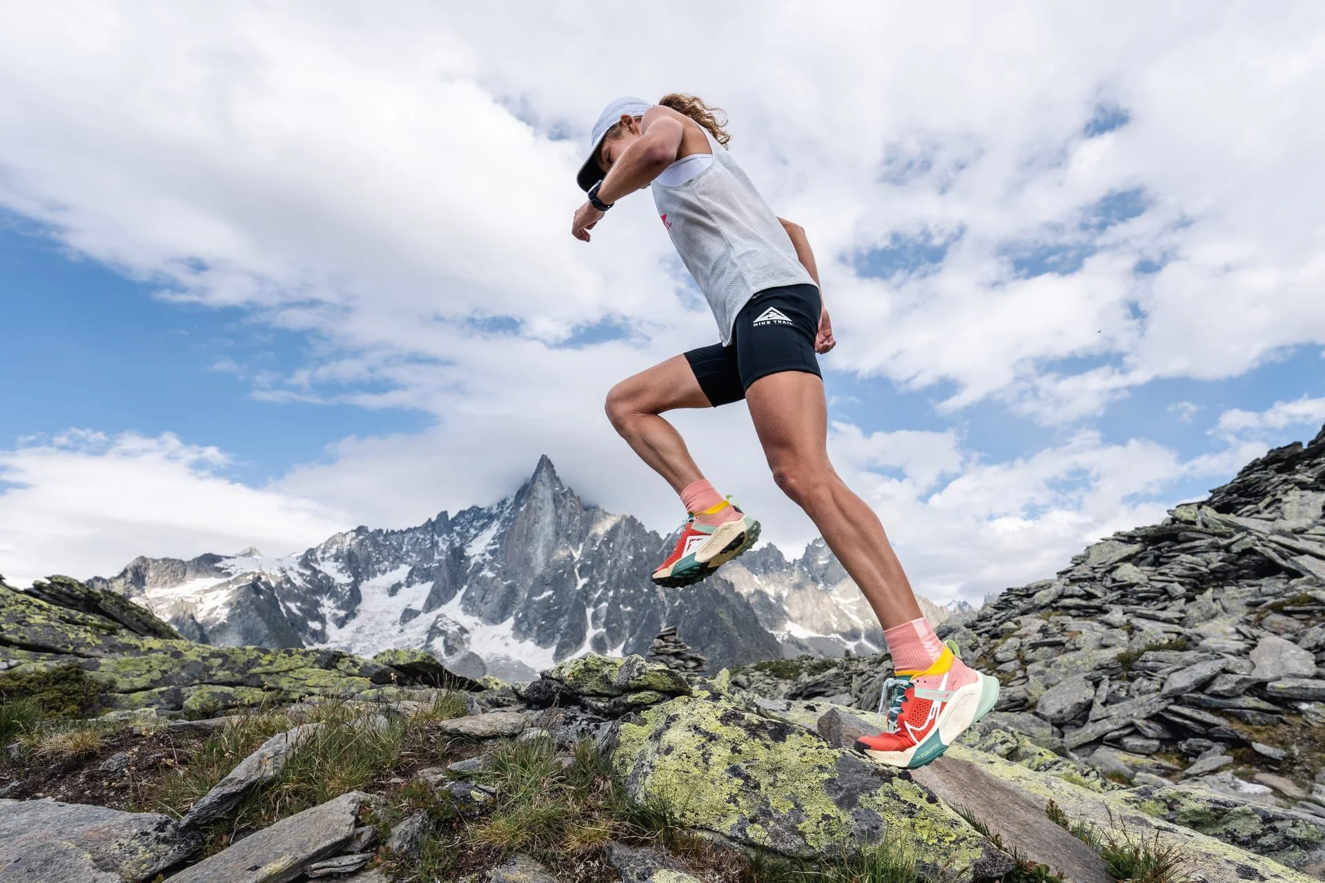
Nike Zegama's Scenario Photo (Nike product page)
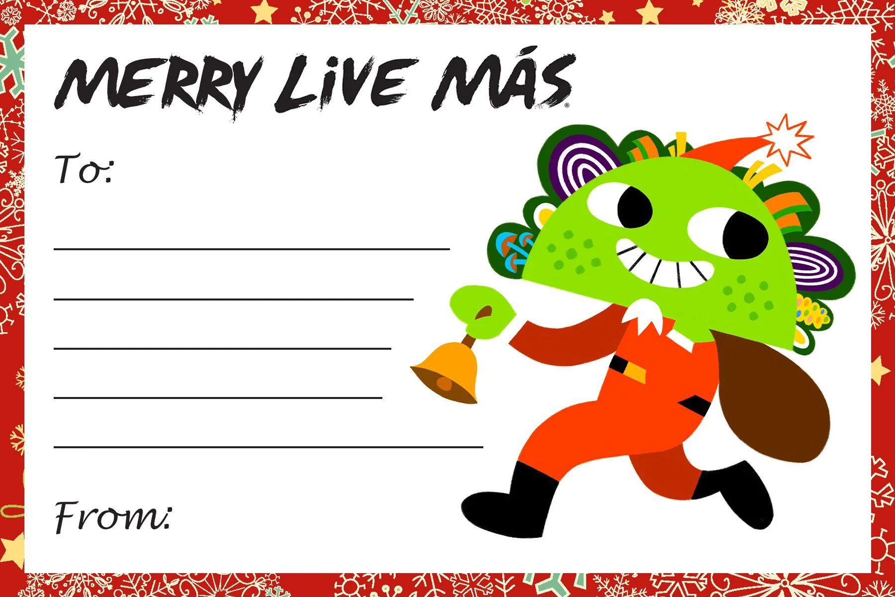
Unofficial Taco Bell Christmas Postcard Design
For this personal project, I wanted to incorporate my illustration and character design as part of a Christmas postcard mock up. “Jingle Bells” song was my inspiration behind my ideas. I designed my taco Santa running with one hand holding a gift bag and another with a hand bell. Given the classic red Santa Claus apparel color, I designed my taco Santa as a vegetarian character with green colors to provide high contrast from the red garment. By changing the classic “Jingle Bells” song lyric with “Taco Bell” instead of “Jingle Bells”, I was able to use this more branded lyric as my background typography pattern for the front side of my postcard. Taco Bell’s slogan is “Live Más”. Therefore, I chose “Merry Live Más” in place of “Merry Christmas” to make my postcard design even more related to Taco Bell’s branding.
Taco Bell Postcard Front Design
Taco Bell Postcard Back Design

Taco Santa
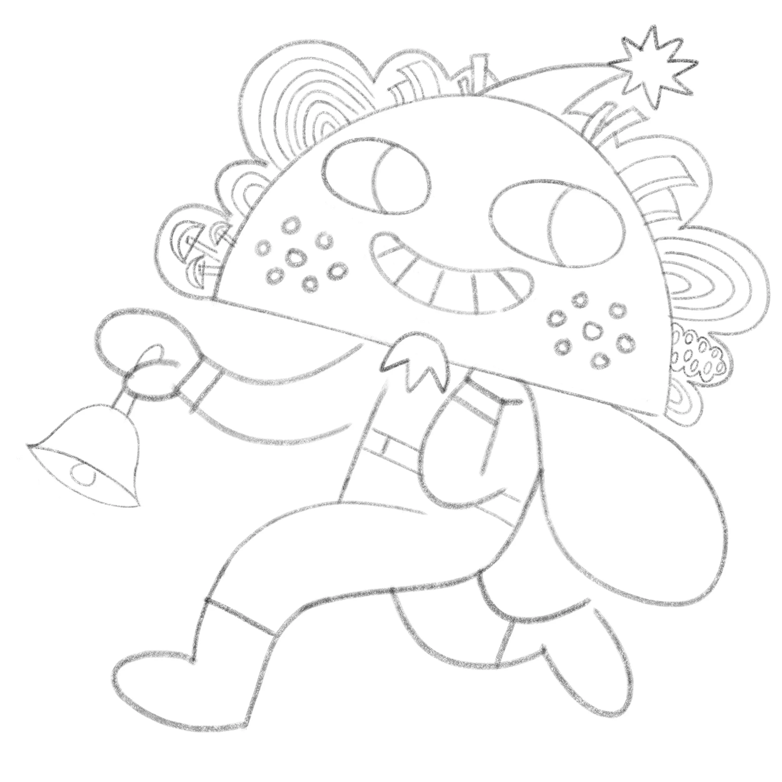
Taco Santa Line Art

Taco Bell Postcard Front Design no logo
Unofficial Sanrio Gudetama Coaster Design
For this personal project, I wanted to redesign my favorite Sanrio character, Gudetama, with some Bob Ross elements. I introduced broccoli hair, beard, and paintbrush into my design to make my illustration look more fun. Gudetama usually sits on its egg white. In my redesign, I turned the egg white into a painting palette. Bob Ross’ painting tutorial videos always featured him painting inside a dark room. Therefore, I chose a similar theme as the background of my coaster design. I’m a hardcore lover of wood. So it was no surprise I chose wood as the back side material of my coaster. I call my Gudetama “Gudetama B. Ross”, with “B” standing for “Broccoli”. Gudetama is well-known for having a laid-back attitude. That’s why I went with “art is hard” as the supporting tagline above its name.
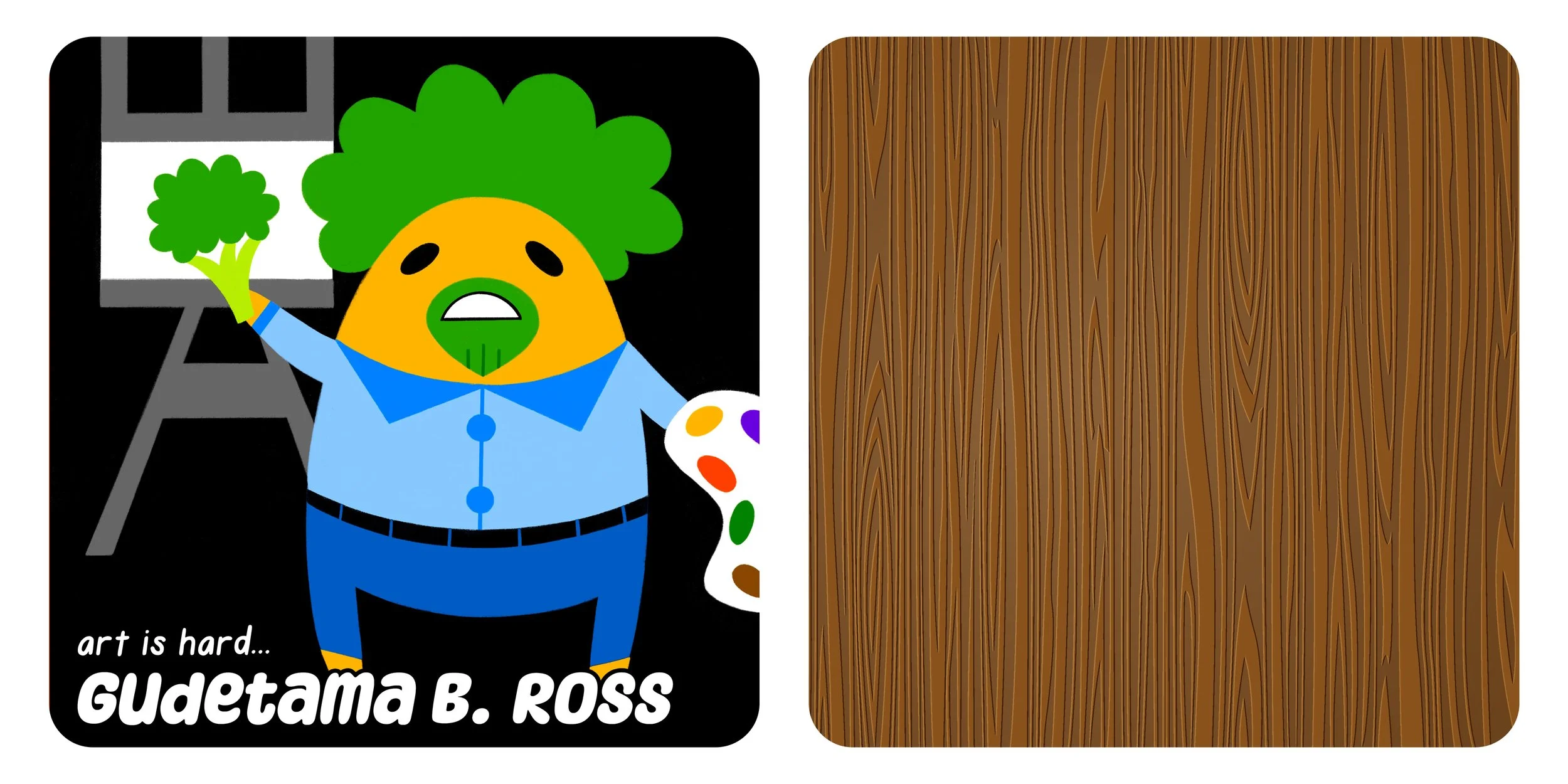
Front and Back Sided Gudetama Broccoli Ross Coaster Design

Gudetama Broccoli Ross with Tagline

Gudetama Broccoli Ross Art

Gudetama Broccoli Ross Line Art
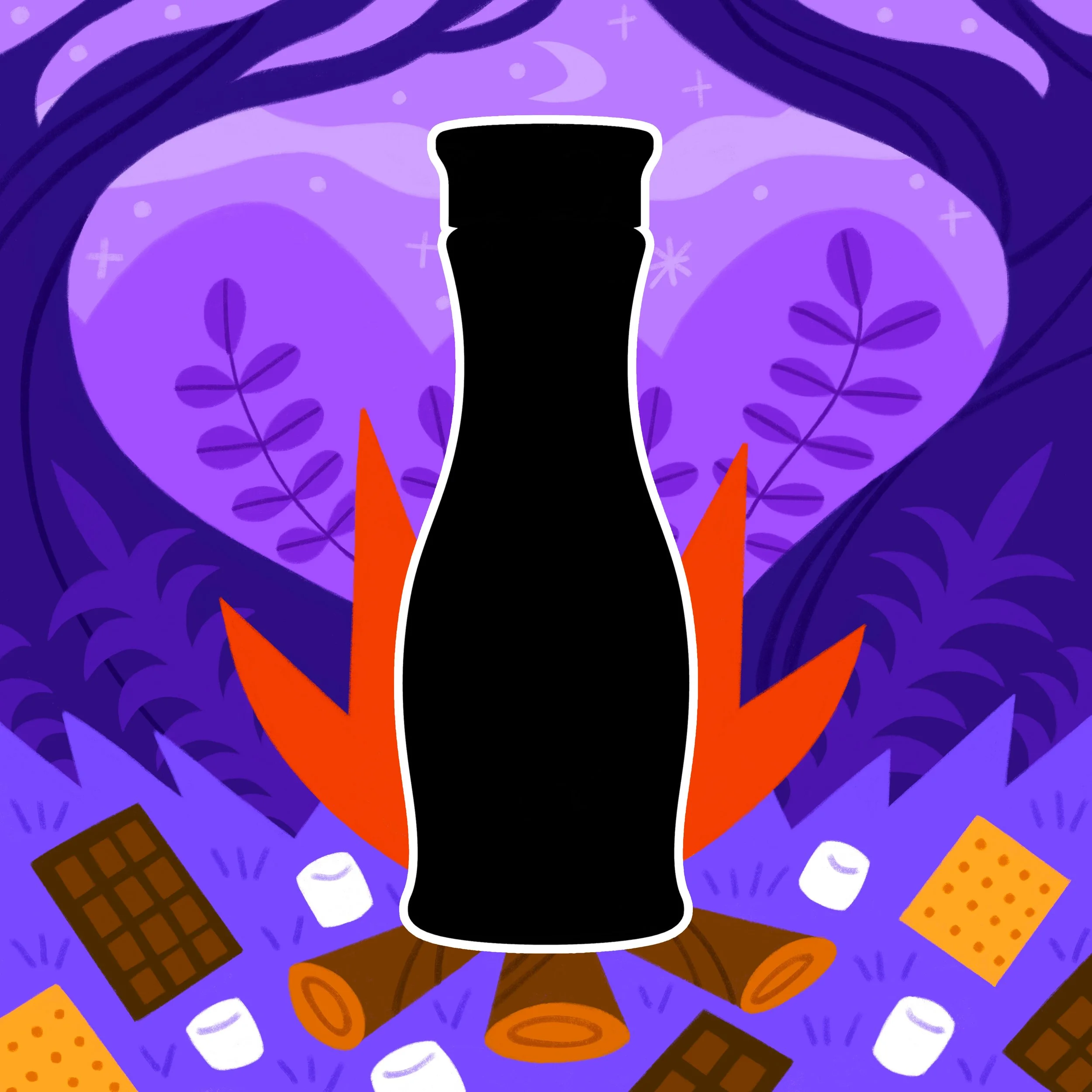
Unofficial Califia Farms S’mores Oat Creamer Teaser Graphic Design
For this personal project, I wanted to design a teaser graphic for Califia Farms’ S’mores Oat Creamer, with my own flair. Giving off some clues to the audience is an important element in teaser graphics. I illustrated a s’mores and campfire type of landscape drawing as my background. I designed most of my illustration with an ultramarine blue color scheme, and only showed campfire and s’more ingredients their true colors. I found a transparent PNG of the creamer from Google. With the image, I added color overlay and stroke effects to make it pop out from the graphic. Califia Farms’ social media graphics have a fun and engaging style to them. Therefore, I tried making my design resonate with Califia Farms’ visual approach as closely as possible.
S'mores Oat Creamer Teaser Graphic

S'mores Oat Creamer Background Art

S'mores Oat Creamer Background Line Art